Completely different and yet very familiar: After more than 30 years, the Association of International Motor Vehicle Manufacturers presents a new corporate design. For this purpose, not only the logo itself, but also the entire corporate design has been completely revised.
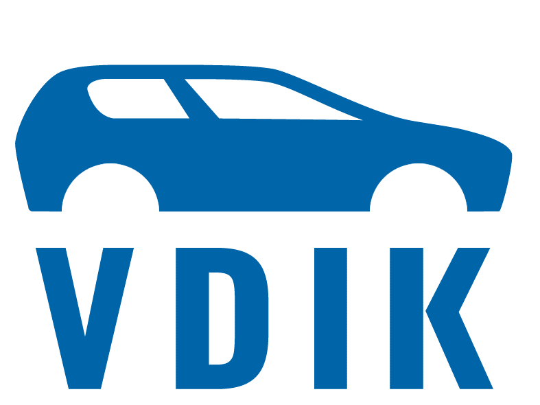
VDIK President Reinhard Zirpel emphasized: “The new, clear corporate design will ensure a continuous brand presence with a high recognition value. Our goal with the new logo was to show at first glance what is at the center of the VDIK’s work: the car.” Therefore, the car silhouette is the central element of the new logo as well. However, the stylized vehicle is now recognizably oriented towards more modern car shapes. The car silhouette is supported by the VDIK lettering, forms a unit with it and thus conveys the mission of the association.
Furthermore, the design language of the new design is best suited for all application areas and communication channels. The familiar VDIK blue has been complemented by additional colors in order to optimize the diversity and expressiveness of information.
The agency FORA Strategy & Communications from Vienna is responsible for the new VDIK corporate design. FORA had already supervised the conception and implementation of the new VDIK magazine “Antrieb”.
Attachment to the press release:
VDIK Corporate Design Manual